

Sections and fields
Lay out the form: section cards, field rows, drag-and-drop reordering, and the live preview.
The Fields scope is where you lay out the form — the sections it is divided into and the input fields inside each section.
Open a form in the Form Builder (its Label link, or Edit Form on the Form List), then pick Fields in the left sidebar.
Sections
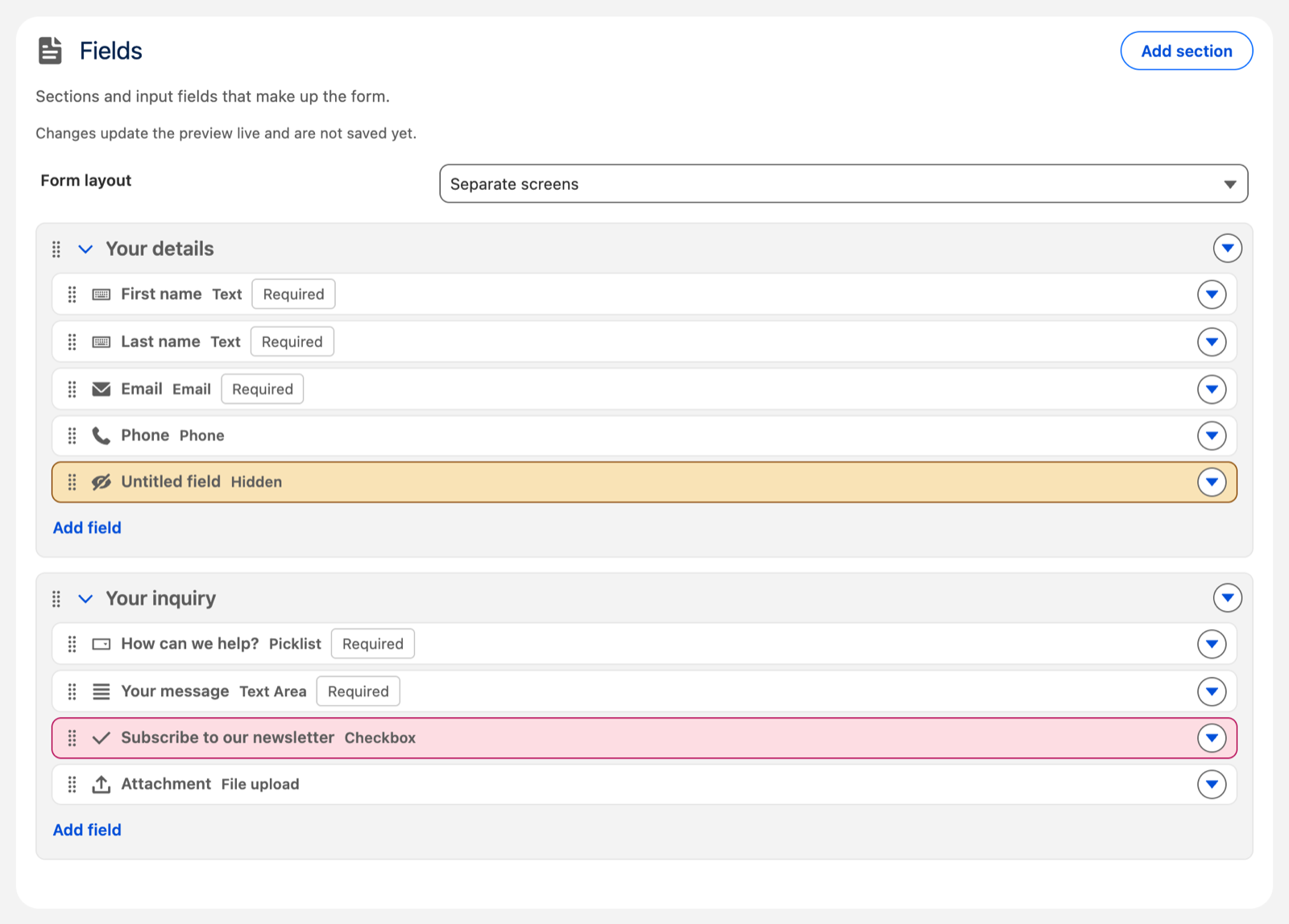
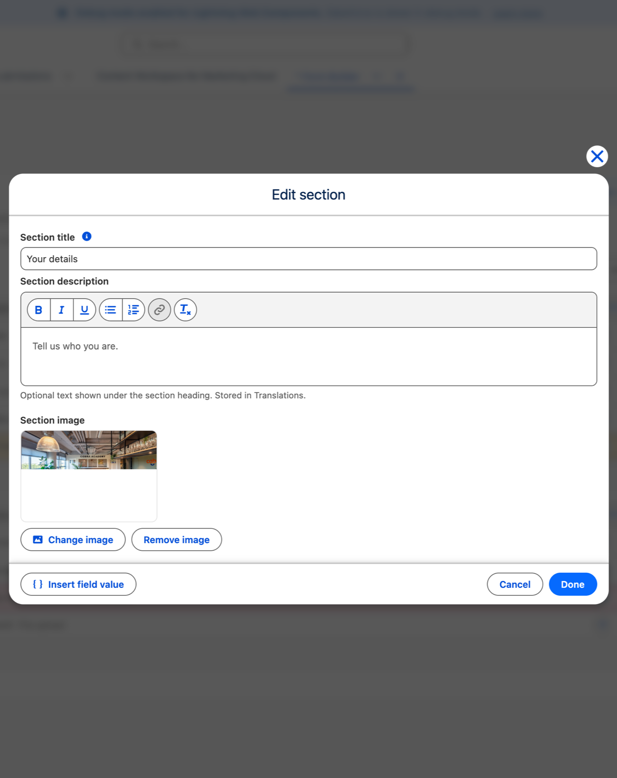
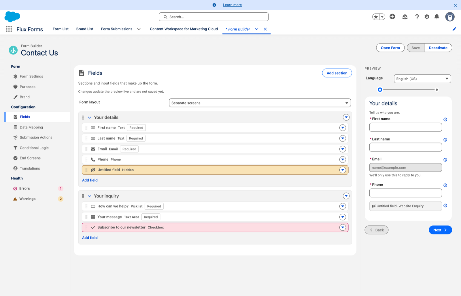
Each section is a card. Click its title to open a dialog where you set:
- the section title
- an optional description — a rich-text editor: bold, italic, bulleted and numbered lists, and links. Images are intentionally unavailable, so formatting always stays inside your branding.
- an optional section image. See Section images.
Add section opens the same dialog for a new one.
To rearrange: drag a section by its grip — the handle at the left of the card. The actions menu (▾) also offers Edit, Delete, Move up and Move down. Collapse a section with the chevron when you want it out of the way.
Fields
Inside a section, Add field opens the field editor, and clicking any field row opens it for that field. The editor groups its inputs under General, Behavior, Validation, Options and File options so they are easy to scan.
Every field gets a type and a label, plus optional help text — also a rich-text editor (bold, italic, underline, lists, links, and a remove-formatting button; no images). Help text shows inline beneath the field, formatted as the visitor sees it.
See Field types and validation for what each type offers.
Reordering fields
Drag a field by its grip. You can drop it:
- within its section — on a field to place it at that spot
- onto another section — on a field there to place it at that spot, or anywhere in the section's body (the section highlights) to add it to the end
Dropping into the body also works for an empty section. A field keeps its label and all its conditional-logic rules when it moves.
Its actions menu (▾) holds Edit, Duplicate, Delete, and Move up / Move down — the keyboard-friendly way to reorder, which moves a field within its own section only.
The preview pane
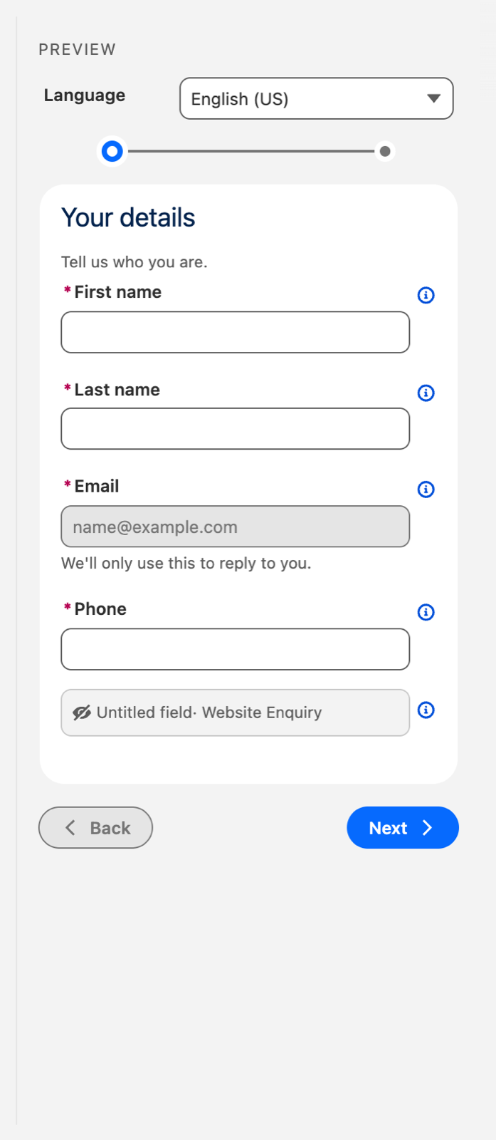
The preview on the right updates live and is a working, fillable form. Type into it. Your conditional-logic rules run for real — fields show, hide and become required as you answer.
A field with special behaviour carries a small behaviours icon on the right. Hover it for a tooltip describing how the field behaves (required, driven by or controlled by a rule, prefilled, hidden, read-only), plus details: its type, default value, and prefill target. A field with nothing special to report shows no icon, which keeps the preview clean.
Field and section labels you type are stored against the form's default language in its translations. That is why editing the default language in the Translations scope also changes what you see here — they are the same text.