

Brand Builder
Create and edit the shared themes: colours, typography, shape and logo, with a live preview.
Brand themes are reusable — one theme can style many forms — so they are managed in their own place, the Brand Builder, which works just like the Form Builder.
The Brand List
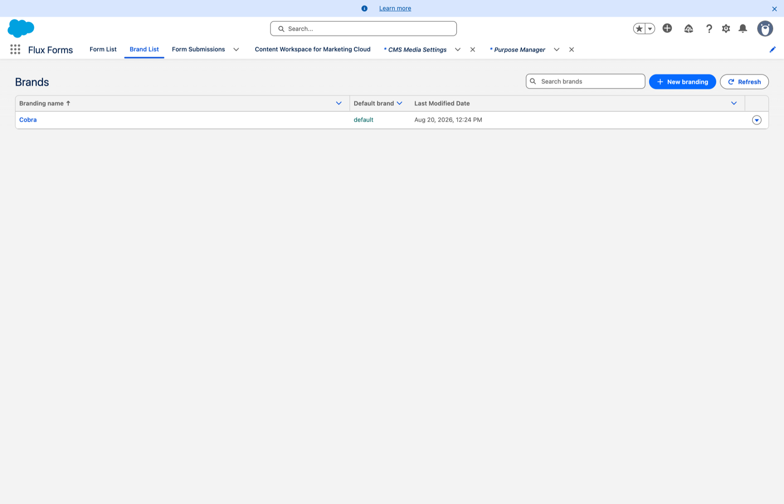
Flux Forms app → Brand List gives you a searchable, sortable list of themes.
- The Name links into the Brand Builder.
- Default brand shows a green default tag on the org default.
- Last Modified Date tells you when each was last touched.
- New Brand starts a blank theme.
The ⋮ actions menu on each row offers:
- Edit — open it in the Brand Builder
- Set as default — make it the org default immediately, clearing the previous one
- Duplicate — create a "(copy)" you can tweak
- Delete — forms using it fall back to the default; you are asked to confirm
The scopes
The left sidebar groups the theme into Brand → Details and Theme → Colors / Typography / Shape / Logo. Pick a scope on the left, edit it in the middle, and watch the live preview on the right update as you type.
- Details — the theme name, and whether it is the Default branding.
- Colors — primary, background, text and so on. Each is edited with a colour picker: click the
swatch to pick visually, or type a hex value like
#1D73C9. Clear a value to keep the design-system default rather than fighting it with an approximation. - Typography — font family and heading weight.
- Shape — corner radius and spacing.
- Logo — Choose image opens the same Salesforce CMS picker used for section images. Set its
alt text and height (for example
40px). Change image picks a different one and Remove image clears it.
The preview's layout dropdown
The preview has a Form layout dropdown carrying the same Single page / Separate screens options a form can be set to. Switch it to see how your theme looks in each layout — Separate screens shows the wizard chrome, a brand-coloured step indicator with Back and Next buttons, so you can check your colours against the stepped experience.
This choice only changes the preview. It is never saved to the theme.
Saving, and what it affects
Click Save in the header. Because themes are shared, editing one affects every form that uses it — check the Brand List for how widely a theme is used before you redecorate.
Seeing it on a real form
Open Form in the header opens the theme on an actual form. Because branding is always applied on
top of a form, the dialog asks which active form to preview it on; the theme is fixed to the one
you are editing. Copy Link or Open loads that form on your public site with this theme applied
(?f=…&b=…).
It is available once the theme is saved and has no unsaved edits.